|
Navigation is what makes or breaks a website, or at the least, eases or frustrates a visitor. It's no coincidence that pioneer Netscape chose to name their browser Navigator ( as opposed to a name like Explorer). The worst thing is to have to "BACK" out in order to proceed, or get lost exploring a site. The objective of navigation is to lead the visitor to where they need to go, in the simplest fashion possible, and then where they need to go from there.
CyberAlley has always prided itself on managing both simple and megasites with creating a navigational process first and foremost in the development process. During or after flowcharting a site, the question is what kind of site is this? A brochure-type site? A catalog site? An institutional website? E-commerce? Strictly informative? Answering these questions helps to determine what kind of navigational device is needed. Buttons along the top? Side? Both--for convenience? Or, is this the type of website that you want to navigate the visitor through the content of the page before they depart--rather than skipping through what you just led them to? Perhaps spending a considerable amount of money to lure them to your website in the first place.
Buttons should never overpower the content of the page. Nobody goes to a website to marvel at buttons. Ideally, buttons should be almost invisible. You know they are there, but they don't distract from the content of the page. That is, until you need them where a roll-over brings them to life. The exception is when the buttons are part of a thematic device and then again this is best when they don't distract from the content. Usually used in a brochure-type website, bookended at the bottom of the page. The last thing the visitor encounters before they continue on. This allows the designer of the website to lead a visitor to where they need to go, without throwing all the links in a confusing (dis)array at them. Even if the desire is to provide all links in a singular fashion, that can still be done without trashing the webpage. A small pop-up window floating aside the webpage can neatly contain them.
Another navigation method to keep in mind is utilizing secondary links within the content of the page. That is, links or buttons that shoot the visitor down or around the page, or deeper into a pertinent subject.
Below are some examples CyberAlley has utilized in websites that reflect these principles:

Tamaroff Automotive Group
Southfield, MichiganUsed 1996-1998
This navigation console rode at the very bottom of each of Tamaroff's 220+ webpages, so any other page was only within a couple clicks away. This console was utilized before the WWW knew any animation capabilities and even before client-side image maps. This thematic navigation device was CyberAlley's first foray into any kind of navigation device. As explained above, this kind was purposed to draw the vistor through the page to get to it.
Click any button on it to drive into the Tamaroff site.

Holley Performance Products
Bowling Green, KentuckyUsed 1996-present
Adopting the practice from the Tamaroff site, a navigation control was established to reflect the main sections of the website. This navigator sports a GIF animation and a client-side image map. Originally launched with eighty pages, Holley's site has grown to as many as 20,000 pages. This navigator has been on the bottom left corner of each and every page beyond the home page since day one.
An example of subdued buttons was utilized on Holley's "animated" homepage for a period. This practice was then carried over to the new Holley home page design, as well as all the Holley brand home pages. The multitude of links were packed into a neat, little, floating Holley SPEEDlinks pop-up window.
US Trailer Company
New Hudson, MichiganUsed 1998-2002
This is an example of simple, subtle side buttons in a frame controlling the contents of the frame to the right. They're stationary, navigating to the main subsections of the site and are supported by primary and secondary text links in the content.

..............................Page Content.

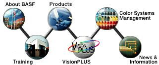
BASF Automotive Refinish
Southfield, MichiganNavacule used 1998-2000, the bookends used 1998-present
The navecule was designed to meet corporate guidelines and was common to each page on the site, while the bookends are examples of secondary linking devices pertinent to the individual page. The top bar leads the visitor to locations within the page, whereas the bottom bar links to other relevant pages. The bookends, as well as the content inbetween are still utilized, but the navecule has changed with corporate structure.

Electro-Matic Products
Farmington Hills, MichiganUsed 1997-1999
This control panel was a navigation device at the bottom of each Electro-Matic website black page. This site used a variety of secondary links, too. The company logo sports a slick animation inking out the lines of the logo from the black background.
Automotive Public Relations Council
Research Triangle Park, North CarolinaUsed 1998-1999
This is another example of simple, animated links in a stationary frame controlling the contents of the frame to the right. They navigate to the main subsections of the site.
Below is a final example of secondary links that are relevant to the page and subsection. The navigation device below is subdued until needed. The words foggy, illegible until a rollover brightens them. Both the website navigational controls and the secondary links are there, but not intrusive, ready to serve their purpose -- not yelling out, "Look at me."
|
